Rail Planner
App Redesign
Add breakpoints to your blank page, then drop sections to have them responsive out of the box.
Problem Statement
Eurail Rail Planner is an app that allows travelers to plan their train trips across Europe. Since the current UI is too plain and doesn’t create a memorable experience, we redesigned the app’s main flow.
Objectives & Goals
Redesign Rail Planner’s App to make it more visually appealing, modern, and memorable.
Will achieve this by redesigning it’s main components and their principal flow.
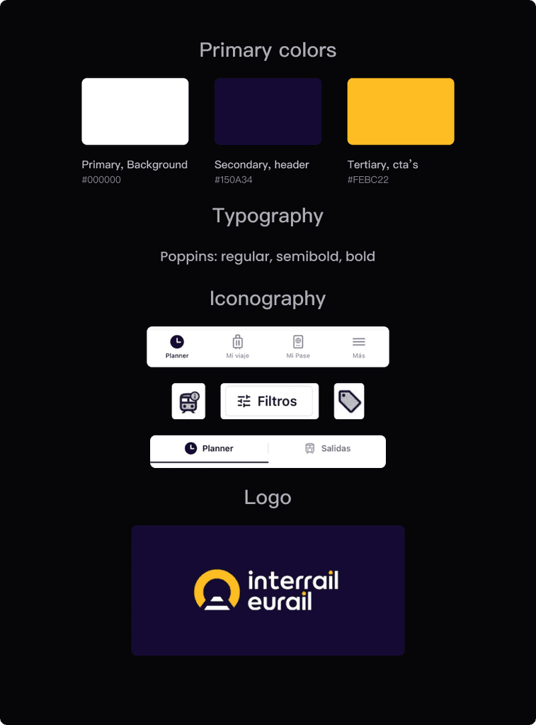
Visual elements in current design
Good use of padding and overall sizing and font variants (weight, proportion, etc)
The design is too plain, and.. kinda boring! Colors are not friendly or modern enough, and the components are too square
The visual elements are sometimes too small, and too “web” looking
There is no consistency, for example, when choosing the styling of the icons, and there are no illustrations (and lots of empty space to use them)
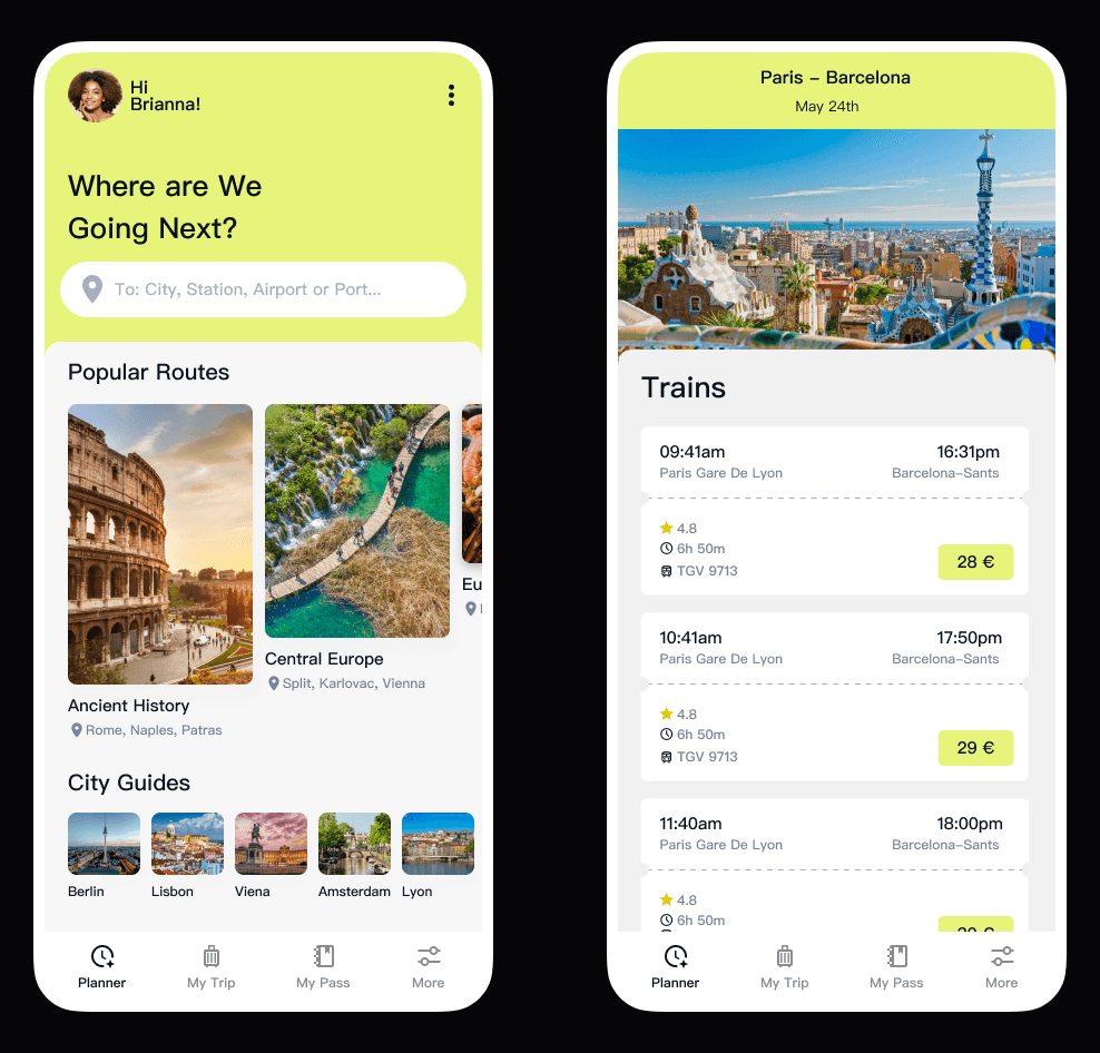
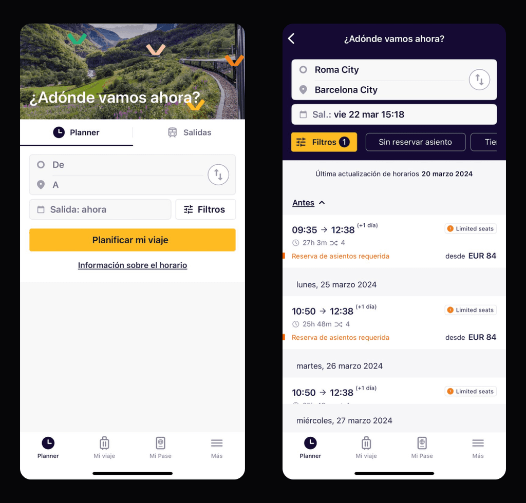
Current app main flow
Good use of padding and overall sizing and font variants (weight, proportion, etc)
The design is too plain, and.. kinda boring! Colors are not friendly or modern enough, and the components are too square
The visual elements are sometimes too small, and too “web” looking
There is no consistency, for example, when choosing the styling of the icons, and there are no illustrations (and lots of empty space to use them)